Stressed about creating eye-catching images for social media? Banging your head against the wall trying to reach that airy, clean look for your clients? I have a few secrets to let you in on so you don’t have to! (plus, your hair is too pretty to do that.)
I’m going to walk you through easy, memorable tips to keep in mind the next time you’re working on social media. These tips work for both DSLR cameras and phone cameras so we got you covered.
Let’s get started.
1 Find your mood.
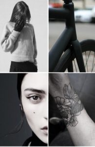
If you haven’t heard, a mood board is a collage of images, typography, colors, etc. that gives you the freedom to explore possible aesthetics for your social media account. Before you create this, ask your client if they have a social media stylebook that will give you a clear direction. If not, ask them directly for this insight. Feeling crafty? Grab those scissors, old magazines and tape to make one you can feel with your hands. Feeling techy? There’s sites that give you the ability to create one digitally. For example, Canva is your hands and tools with their free online mood board creator.

2 All of the Lights (plays Yeezy now…)
We’ve all heard it – “lighting is key”. But it’s so true! Lighting is one of the most important tools, if not THE most important tool, to use when creating images in general. Some assume you need professional lighting with umbrellas and light stands to do the job – FALSE! While that can be used in some cases, you can get by with simply knowing the direction of your light and intensity. Whether you’re using a DSLR or phone camera, look for soft lighting rather than direct sunlight. Using the sun alone will create over exposed (or blown out) images and you will lose the true colors in your photo. Place your subject in front of the window and shoot from the side. This creates shadows and gives definition to your images. Remember to keep the focus of your image well lit so it stands out from your background.
3 Wonderwall
This is where it gets really fun, y’all. Your background can make or break your image. If you’re going for the light and airy look, style the composition of your photo to have a pop of white as the brightest point of your image, and do this in every single image. Make it a point to keep your background white or a light color to brighten every photo and, overall, brighten your profile aesthetic. If you’re more into the moody feel, go for shadows and darker neutrals. I say this is the fun part because you really get to play with color and explore creativity.

4 Stay on the Grid
Our last quick and easy tip for creating better images is using that handy little grid tool when taking a photo. In photography lingo, it’s following the rule of thirds. This rule simply means a photo is compositionally more appealing if the subject lies on the grid lines or their intersections. Most phones, and professional cameras, have a grid option available which helps you line up your photographs to follow this rule. Try aligning a skyline with the upper gridline or even the lower gridline. Remember, this is only a guide to help with composition. Don’t forget to have fun with it!
Now, go out and create!
I’d love to see you put these tips to work!
Follow me on IG: @victoriaxperezz
VP
